Unplugged
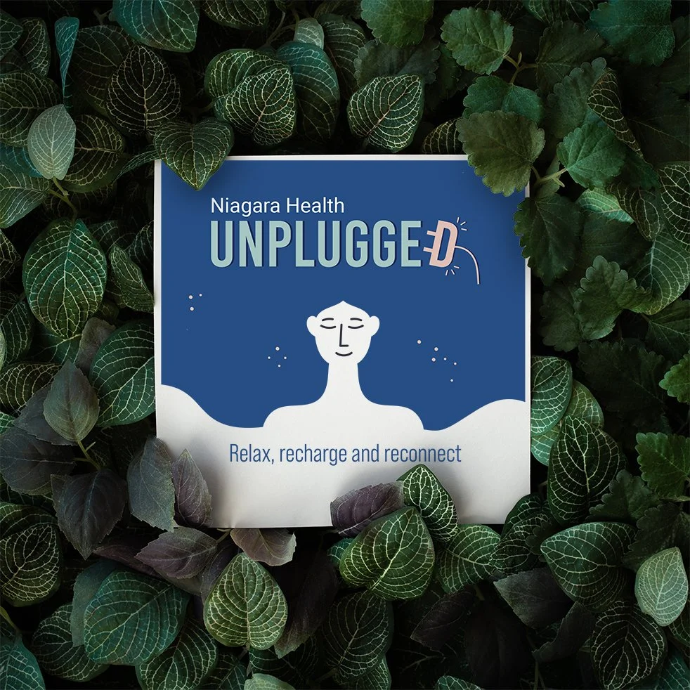
Sub-brand identity for employee wellness program. Goal was to design a visual identity that felt warm, inviting and aligned with the existing corporate branding.
THE CHALLENGE: The visual identity needed to reflect relaxation, well-being, and connection, while still feeling cohesive with Niagara Health’s overarching brand.
DESIGN APPROACH
A bold yet friendly sans-serif typeface that conveys strength and warmth.
Warm tones complementing Niagara Health’s brand colors, ensuring consistency while adding a more inviting touch.
The "D" in UNPLUGGED was transformed into a power plug, reinforcing the program’s theme of unplugging from work and recharging.
A minimal, human figure with flowing hair acting as a background for copy, adds a personal and calming touch to the design.
OUTCOME: The final design successfully captured the essence of relaxation and reconnection. It was well-received by employees, helping to establish "Unplugged" as a recognizable and welcoming program within the organization.
